
If you’ve ever opened a Python tutorial and immediately hit a wall of library options — Matplotlib, Seaborn , Plotly, Bokeh, Altair — you know exactly what I’m talking about. Choosing the best plot library in Python for data analysis is one of those decisions that sounds simple but actually makes or breaks your entire workflow.
I’ve been working in data analysis for several years, and honestly? I’ve made every mistake possible — spending hours fighting Matplotlib syntax for something Seaborn could have done in one line, or using an interactive Plotly chart when a clean static PNG was all that was needed. This guide is built on real experience, not just documentation copy-paste.
Here’s what I’m going to walk you through: a clear, no-fluff comparison of the best Python plot libraries, real-world use cases for each, a step-by-step decision framework you can actually use today, and a beginner-to-advanced roadmap. Whether you’re just starting with Python visualization or you’re building production dashboards, this guide is for you.
💡 Quick Navigation: Jump to the Quick Answer section if you just need a fast recommendation. Stay for the full comparison if you want to understand the why behind every choice.
Quick Answer — Which Python Plot Library Should You Use?
Before we dive deep, here’s the honest, experience-backed quick answer. I’ll expand on each of these throughout this guide.
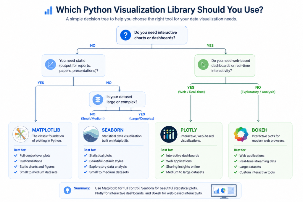
If You Want Full Control → Use Matplotlib
Matplotlib is the grandfather of Python plotting. If you need pixel-perfect control over every element of your chart — axis tick positions, custom fonts, specific layout arrangements — Matplotlib is your tool. However, the trade-off is real: it takes considerably more code to produce results that look polished. I use it when I need highly customized publication-quality charts that other libraries simply can’t produce as flexibly.
If You Want Clean Statistical Visuals → Use Seaborn
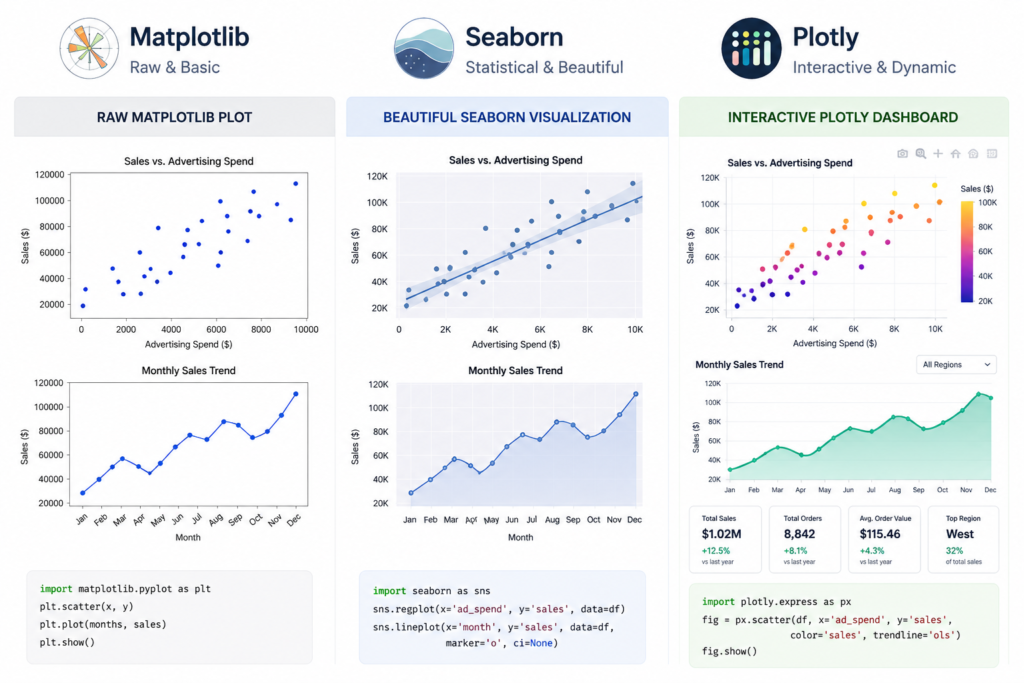
Seaborn is built on top of Matplotlib, so you get all the power underneath with a drastically simpler interface on top. In my experience, Seaborn is the single best starting point for anyone doing exploratory data analysis (EDA). You can produce beautiful distribution plots, correlation heatmaps, and regression plots in just one or two lines. For most data analysts, Seaborn will handle 70% of their daily visualization needs without breaking a sweat.
If You Want Interactive Dashboards → Use Plotly
Plotly is in a different category entirely. If your end goal is a business dashboard, an executive report with interactive charts, or a web-embedded visualization, Plotly is the best Python library for data visualization in that context. It renders charts that users can hover over, zoom into, and filter — which is a game-changer for presentations and stakeholder reporting.
If You Work with Large Data → Consider Specialized Tools
When you’re dealing with millions of rows — think log files, sensor data, or financial tick data — standard plotting libraries start to slow down or crash. In those cases, tools like Datashader, HoloViews, or even Pandas’ built-in plotting (which wraps Matplotlib) with aggregation logic are worth exploring. Performance, not aesthetics, becomes the priority.
Who This Guide Is For
Beginners Starting with Python Visualization
If you’re just starting out and you’re not sure which library to even install first, you’re in the right place. I’ve structured this guide to give you a clear learning path rather than overwhelming you with every option at once. Start here, pick one library, and build from there. If you’re also still learning core Python, check out the best Python course in 2026 before diving into plotting libraries — the fundamentals will make everything click faster.
Data Analysts Working with Power BI / SQL / Python
I know a lot of analysts who are comfortable with Power BI or SQL but are just starting to add Python to their toolkit. For you, Seaborn and Matplotlib are the most practical starting points because they integrate beautifully with Pandas DataFrames — which are likely already part of your workflow. Also, if you’re working toward a formal qualification, the Google Data Analytics Certificate is worth reviewing — it covers Python visualization as part of a broader data analysis curriculum.
Data Engineers Exploring Visualization Layer
Engineers who live in the data pipeline world often need to quickly validate data quality or monitor outputs visually. For this audience, quick-and-dirty Matplotlib or Pandas .plot() is usually sufficient. However, if you’re building monitoring dashboards, Plotly or Bokeh gives you the interactivity that static plots simply cannot offer.
Advanced Users Building Interactive Apps
If you’re building Dash apps, Streamlit dashboards, or embedding Python charts into web applications, Plotly and Bokeh are the libraries that deserve your full attention. Both were designed with web deployment in mind, and they integrate with Python web frameworks cleanly.
What Actually Matters When Choosing a Plot Library (2026 Criteria)
Most comparison articles list features. I’m going to focus on what actually matters in day-to-day data work.
Ease of Use vs Flexibility Trade-off
Every plot library sits somewhere on a spectrum between easy-to-use and highly flexible. Seaborn sits closer to the easy end — you can produce a beautiful chart with minimal code, but deep customization requires dropping down to Matplotlib. Matplotlib sits at the flexible end — almost unlimited control, but significantly more verbose syntax. Understanding where you sit on this spectrum is the first step to picking the right tool.
Static vs Interactive Visualization Needs
This is one of the most important questions to ask before you even open your code editor. Static charts — PNG, SVG, PDF exports — are perfect for reports, academic papers, and print materials. Interactive charts — with hover tooltips, zoom controls, and dropdown filters — are essential for dashboards and web presentations. Therefore, defining your output format upfront saves hours of rework down the line.
Performance with Large Datasets
In my experience, most data analysts don’t think about performance until they’re already staring at a frozen Jupyter kernel. Matplotlib and Seaborn can handle datasets up to roughly 100,000 rows comfortably. Beyond that, performance degrades noticeably. For large datasets, Plotly’s WebGL-powered charts handle millions of points more gracefully. Specialized libraries like Datashader go further still.
Integration with Data Science Stack (Pandas, NumPy)
All major Python visualization libraries integrate with Pandas DataFrames, but the quality of that integration varies. Seaborn is designed specifically to work with Pandas — you can pass a DataFrame and column names directly without any transformation. Matplotlib requires slightly more manual data extraction. Plotly has excellent Pandas support through Plotly Express, which is its high-level interface.
Community Support (GitHub, Docs, Tutorials)
When you’re stuck — and you will get stuck — community resources are invaluable. Matplotlib has the largest and most mature community, with solutions to almost every problem available on Stack Overflow. If you’re looking for best plot library Python for data analysis GitHub examples, Matplotlib and Seaborn repositories have thousands of example notebooks. Plotly also has strong documentation and a growing community, particularly around Dash applications.
Core Python Plot Libraries Compared (Real Use Cases)
Matplotlib — The Foundation of Python Plotting
Matplotlib is the original Python visualization library, and it remains the backbone of the entire Python data visualization ecosystem. When I say Seaborn is ‘built on top of Matplotlib,’ I mean that literally — Seaborn calls Matplotlib functions under the hood. Therefore, understanding Matplotlib gives you the ability to customize any Python chart, regardless of which library created it.
Where it truly excels is in producing highly customized, publication-ready figures. Think scientific papers, custom financial charts, or multi-panel report layouts where every pixel matters. For data visualization with Matplotlib in Python, you get fine-grained control over axes, ticks, labels, colors, grids, and figure layout in ways no other library matches.
Where it struggles is speed-to-result. A simple bar chart in Matplotlib that looks polished might take 10–15 lines of code. The same chart in Seaborn takes 2. For exploratory work — where you need to quickly understand your data — that friction adds up. However, for custom financial dashboards, automated report generation, or scientific figure creation, Matplotlib is often the only tool that gives you exactly what you need.
🔬 Real Use Case: I built a custom financial dashboard for a client that overlaid stock price data, volume bars, and a moving average — all on the same figure with dual Y-axes. Only Matplotlib gave me the precise control needed to get the layout exactly right. Seaborn would have gotten me 80% there, but that last 20% required Matplotlib’s low-level API.
Seaborn — Best for Statistical Visualization
Seaborn Python is where I send every analyst who asks me where to start. It’s built on Matplotlib, which means you have the option to customize deeply when needed, but the defaults are genuinely beautiful out of the box. In my experience, most exploratory data analysis projects can be handled almost entirely in Seaborn.
The library shines brightest in statistical visualization: distribution plots (histplot, kdeplot), correlation heatmaps, pair plots for multi-variable exploration, and regression plots with confidence intervals. These are the charts you reach for constantly during EDA, and Seaborn in Python makes them effortless.
One important thing to understand: Seaborn is opinionated. It makes smart design decisions for you, which is great 90% of the time and limiting the other 10%. For example, when you need highly custom color schemes or non-standard chart types, you’ll find yourself dropping back to Matplotlib. That said, for distribution analysis, regression visualization, and correlation analysis, Seaborn is the single best Python library for statistical data visualization.
📊 Real Use Case: During a sales performance analysis, I needed to quickly visualize relationships between 12 different KPIs. Seaborn’s pairplot() produced a beautiful 12×12 grid of scatter plots with correlation insights in literally one line of code. That single chart identified three non-obvious correlations that drove a significant strategy change.
Plotly — Best for Interactive Visualization
Plotly operates in a fundamentally different category from Matplotlib and Seaborn . Where those libraries produce static images, Plotly produces interactive web-based charts by default. Every chart is rendered using JavaScript, which means it supports hover tooltips, zoom and pan controls, click-to-filter functionality, and animation sequences.
For business analytics and executive reporting, Plotly is genuinely transformative. Instead of emailing a static bar chart and hoping the recipient understands it, you can share an interactive HTML file where they can explore the data themselves. The Plotly Express high-level interface is also surprisingly easy to use — many charts require no more code than Seaborn .
The main trade-off is file size and rendering overhead. Interactive charts are larger files than static images and require a browser to render properly. For printed reports or PDF exports, Matplotlib is still the more practical choice. However, for executive dashboards and stakeholder presentations, Plotly is the clear winner. If you’re building toward a data analyst career, understanding Plotly is increasingly expected — check out the data analyst certification online to see where Python visualization skills fit into the broader certification landscape.
Altair — Declarative Visualization Approach
Altair takes a completely different philosophical approach from the other libraries. Instead of telling Python how to draw a chart step by step (imperative), you declare what you want to see and Altair figures out how to draw it (declarative). This makes Altair code remarkably readable and concise. However, the library has a steeper learning curve in terms of its grammar, and it’s less well-known in production environments. For academic work and exploratory analysis with complex multi-variable relationships, Altair is worth learning.
Bokeh — Web-Based Visualization Power
Bokeh is Plotly‘s primary competitor in the interactive visualization space, but with a stronger emphasis on streaming and real-time data. If you’re building a web application that needs to display live data — stock feeds, IoT sensor readings, server monitoring metrics — Bokeh handles streaming updates natively in a way Plotly doesn’t support as elegantly. Bokeh is also the backend that powers HoloViews, which is worth knowing if you’re working with very large datasets that need interactive exploration.
Side-by-Side Comparison (What Actually Works)
Learning Curve Comparison
| Library | Learning Curve | Time to First Good Chart | Documentation Quality |
| Matplotlib | Steep | 1–2 hours | Excellent (extensive) |
| Seaborn | Gentle | 15–30 minutes | Very Good |
| Plotly | Moderate | 30–60 minutes | Excellent |
| Altair | Moderate–Steep | 1–2 hours | Good |
| Bokeh | Steep | 2–4 hours | Good |
Performance Comparison (Small vs Large Data)
| Library | < 10K Rows | 10K–100K Rows | > 100K Rows | Rendering Speed |
| Matplotlib | ✅ Excellent | ✅ Good | ⚠️ Slows | Fast (static) |
| Seaborn | ✅ Excellent | ✅ Good | ⚠️ Slows | Fast (static) |
| Plotly | ✅ Excellent | ✅ Good | ✅ WebGL handles well | Moderate |
| Bokeh | ✅ Excellent | ✅ Good | ✅ Streaming support | Moderate |
| Datashader | N/A | ✅ Good | ✅ Millions of rows | Optimized |
Customization Capability
| Customization Area | Matplotlib | Seaborn | Plotly | Bokeh |
| Chart Types | ⭐⭐⭐⭐⭐ | ⭐⭐⭐⭐ | ⭐⭐⭐⭐⭐ | ⭐⭐⭐⭐ |
| Color Control | ⭐⭐⭐⭐⭐ | ⭐⭐⭐ | ⭐⭐⭐⭐ | ⭐⭐⭐⭐ |
| Layout Control | ⭐⭐⭐⭐⭐ | ⭐⭐⭐ | ⭐⭐⭐⭐ | ⭐⭐⭐⭐ |
| Theming | ⭐⭐⭐ | ⭐⭐⭐⭐⭐ | ⭐⭐⭐⭐ | ⭐⭐⭐ |
| Annotations | ⭐⭐⭐⭐⭐ | ⭐⭐⭐ | ⭐⭐⭐⭐ | ⭐⭐⭐⭐ |
Interactive vs Static Output
| Feature | Matplotlib | Seaborn | Plotly | Bokeh | Altair |
| Static PNG/SVG | ✅ | ✅ | ✅ | ✅ | ✅ |
| Interactive HTML | ❌ | ❌ | ✅ | ✅ | ✅ |
| Hover Tooltips | ❌ | ❌ | ✅ | ✅ | ✅ |
| Zoom/Pan | ❌ | ❌ | ✅ | ✅ | ✅ |
| Real-time Streaming | ❌ | ❌ | ⚠️ | ✅ | ❌ |
| Jupyter Inline | ✅ | ✅ | ✅ | ✅ | ✅ |
Best Use Case Mapping Table
| Use Case | Best Library | Second Choice | Why |
| EDA / Exploration | Seaborn | Matplotlib | Fast, clean statistical plots |
| Publication / Reports | Matplotlib | Seaborn | Pixel-perfect control |
| Executive Dashboards | Plotly | Bokeh | Interactive, shareable HTML |
| Real-time Data | Bokeh | Plotly | Native streaming support |
| Large Data (1M+ rows) | Datashader | Plotly WebGL | Performance optimized |
| Web App (Dash/Streamlit) | Plotly | Bokeh | Best framework integration |
| Academic / Research | Matplotlib | Altair | Publication-standard output |
| Quick Business Charts | Plotly Express | Seaborn | Simple syntax, great defaults |
Step-by-Step Framework to Choose the Best Plot Library
Step 1 — Define Your Goal (Exploration vs Presentation)
The very first question I ask on any data project is: what am I trying to accomplish right now? If you’re exploring data — trying to understand distributions, spot outliers, or identify correlations — you need speed and flexibility. Seaborn or Pandas’ built-in plotting will serve you far better than Matplotlib here. If, however, you’re preparing a chart for a stakeholder presentation or a published report, quality of output matters more than speed of creation, and Matplotlib or Plotly becomes the better choice.
Step 2 — Identify Your Data Type
Different data types genuinely call for different chart types and, therefore, different libraries. Continuous numerical data pairs beautifully with Seaborn’s distribution and regression plots. Categorical comparisons work well with Matplotlib bar charts or Plotly grouped bars. Time-series data has excellent support in both Matplotlib and Plotly. Network or graph visualization data is a special case where you’d want to look at NetworkX combined with Matplotlib, or a dedicated graph visualization library.
Step 3 — Decide Static vs Interactive
This is a binary decision that immediately cuts your options in half. If the output is a static image — for a PDF report, an academic paper, a newspaper-style infographic — use Matplotlib or Seaborn . If the output needs to be interactive — for a web dashboard, a Jupyter notebook that stakeholders will explore, or a Dash/Streamlit app — use Plotly or Bokeh. Making this decision early prevents wasting hours building in the wrong library.
Step 4 — Match with the Right Library
With steps 1–3 answered, the library choice becomes almost automatic. Exploration + static + small data = Seaborn . Presentation + static + precision = Matplotlib . Exploration or presentation + interactive = Plotly . Realtime + interactive = Bokeh. Large data + static = Matplotlib with sampling or Datashader. Large data + interactive = Plotly WebGL. Following this logic removes 90% of the ambiguity from the decision.
Step 5 — Validate with Real Use Case
Before committing to a library for an entire project, I always spend 30 minutes prototyping one representative chart. If I can produce something that looks close to my target output in that time, I’m in the right library. If I’m fighting the library at every turn, that’s a signal to reconsider. This small validation step has saved me from building entire projects in the wrong tool more than once.
Real Examples (Data Analyst Use Cases)
Exploratory Data Analysis (EDA) with Seaborn
Here’s a real scenario from a retail sales analysis project. I had a dataset with 50,000 transaction records, and I needed to quickly understand the relationship between product price, discount percentage, and sales volume. In Seaborn , I used a pairplot() to visualize all three variables simultaneously. That one chart revealed a non-linear relationship between discount and volume that completely changed how we structured our pricing recommendations. The total code was four lines.
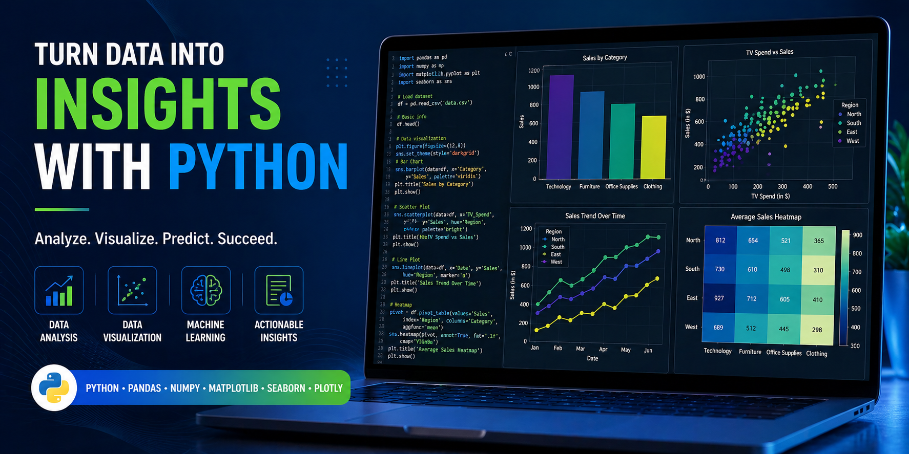
import seaborn as sns
import pandas as pd

sns.pairplot(df[['price', 'discount_pct', 'sales_volume']], kind='reg')
plt.show()

# Result: 4 lines of code, one career-changing insight.
Custom Chart Building with Matplotlib
For a financial services client, I needed to produce a monthly report with a specific chart layout: a primary line chart showing revenue trend, a secondary bar chart showing monthly growth rate on the same figure, custom company branding colors, and a specific footnote format. None of this was possible in Seaborn’s default interface. However, Matplotlib’s subplots() system and axes-level customization made it straightforward — once I got past the initial syntax learning curve. The result was a reusable chart template that the team still uses today.
Interactive Dashboard with Plotly
An executive team at a mid-sized company needed a quarterly performance dashboard they could explore themselves without asking the data team for custom queries. I built it using Plotly Express with Pandas integration. The dashboard had six charts — revenue by region, product mix, customer segment breakdown, trend lines — all linkable through Plotly’s filtering system. The total build time was two days. The team now uses it every Monday morning without any technical support needed. That’s the power of choosing the right best Python visualization library for the job.
Graph Visualization Example (Network/Relationships)
Network and relationship data is a special case in Python visualization. Standard plotting libraries aren’t designed for it. For a social network analysis project, I used NetworkX for the graph structure and Matplotlib for rendering — a combination that’s recommended by both the NetworkX documentation and the data science community broadly. Alternatively, for interactive network graphs, Plotly’s scatter-with-lines approach or Pyvis (which wraps vis.js) provides a more user-friendly experience. This is also an area where Python graph visualization library comparisons on GeeksforGeeks are genuinely useful for finding code examples.
Common Mistakes That Kill Your Visualization Quality
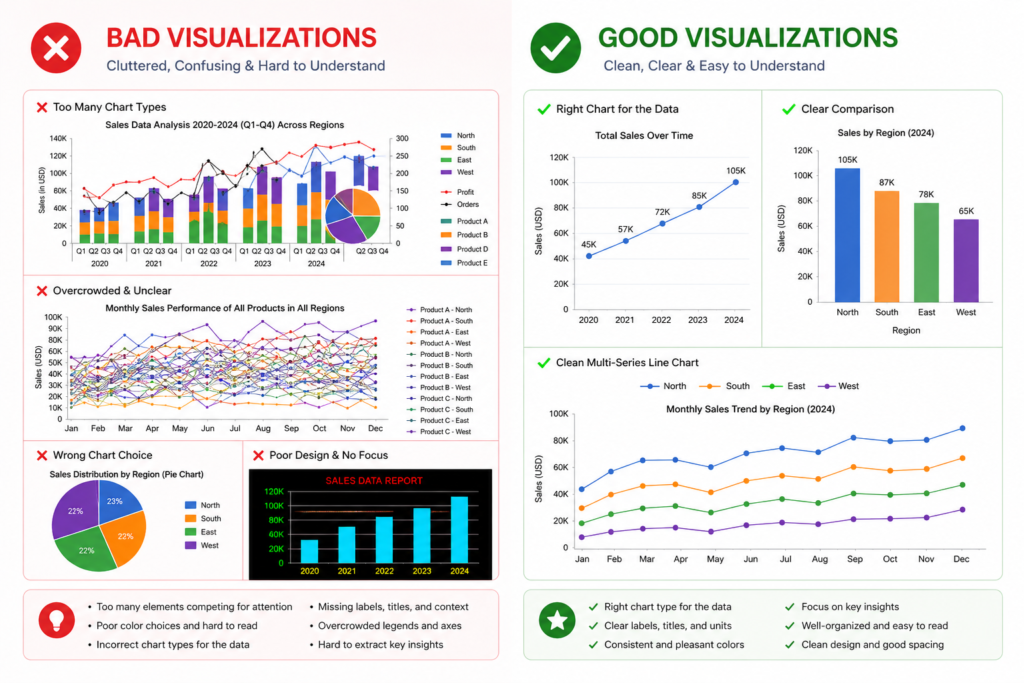
Using Matplotlib for Everything
This is by far the most common mistake I see from beginners who learned Matplotlib first. They reach for it by default, even for tasks where Seaborn would produce better results in 20% of the code. The result is unnecessary complexity and hours lost to formatting that could have been automatic. Use Matplotlib when you need it — for deep customization and publication-grade output — but don’t default to it for everything. Therefore, always ask: would Seaborn or Plotly Express handle this faster?
Ignoring Readability and Design
A technically accurate chart is worthless if your audience can’t read it. I’ve seen beautiful Python plots destroyed by tiny axis labels, missing chart titles, unlabeled data series, and poor color choices. This is where Seaborn’s built-in themes genuinely help — sns.set_theme() immediately improves the visual quality of any plot. For Matplotlib, always set explicit fontsize values, use descriptive titles, and choose colorblind-friendly palettes from the start.
Overcomplicating Simple Charts
More features don’t make a chart better. I’ve watched analysts add 3D effects, gradient fills, and animated transitions to charts that were trying to communicate a single data point comparison. The audience ends up confused rather than informed. The best data visualizations are usually the simplest ones. A well-formatted bar chart often communicates more clearly than an elaborate Plotly figure with 10 interactive filters.
Choosing Interactive Tools Without Need
Plotly and Bokeh add rendering overhead, larger file sizes, and browser dependencies. If you’re generating 50 charts for an automated PDF report, using Plotly for all of them adds unnecessary complexity. Static Matplotlib or Seaborn charts are faster to generate, smaller in file size, and more reliable in automated pipelines. Match the tool to the actual requirement, not to what sounds most impressive.
Not Using the Right Library for Data Size
I’ve seen this crash Jupyter kernels more than once: someone tries to scatter-plot 2 million data points with Matplotlib and waits 10 minutes for a frozen screen. The solution isn’t patience — it’s using the right tool. For large datasets, either sample your data before plotting (valid for exploration), use Plotly’s WebGL renderer (scattergl instead of scatter), or move to Datashader for density visualization. Performance awareness is a mark of an experienced data analyst.
Beginner vs Advanced Approach
Beginner Stack (Fast Learning Path)
If you’re just starting with Python data visualization, here’s my recommended path: Start with Seaborn . It requires minimal boilerplate, produces clean results immediately, and teaches you to think about data visualization in terms of data structure (which column maps to which visual property) rather than rendering syntax. Spend two weeks making distribution plots, bar charts, heatmaps, and pair plots with real datasets. Use Jupyter Notebook as your environment — it displays charts inline and makes iteration fast.
| Skill Level | Primary Library | Secondary Library | Environment | Focus |
| Beginner (Week 1–4) | Seaborn | Basic Matplotlib | Jupyter Notebook | EDA & Statistical Plots |
| Intermediate (Month 2–3) | Matplotlib | Seaborn | Jupyter + Scripts | Customization & Styling |
| Advanced (Month 4+) | Plotly | Bokeh | Dash / Streamlit | Interactive Dashboards |
If you’re serious about building data skills from scratch, the AI courses for beginners and the machine learning courses online both include Python visualization modules that complement this library knowledge.
Intermediate Stack
At the intermediate level, you should be combining Matplotlib and Seaborn fluently. This means using Seaborn for the initial chart construction and Matplotlib’s axes-level functions to customize colors, annotations, and layout. The key intermediate skill is understanding Matplotlib’s figure and axes object model — once you understand that every Seaborn chart is just a Matplotlib figure underneath, you can customize anything. The intermediate stage is also where Pandas’ built-in .plot() method becomes a useful tool for quick plotting during data cleaning.
Advanced Stack
Advanced users should be comfortable building complete visualization pipelines: pulling data from databases or APIs, transforming it with Pandas, and rendering it with Plotly or Bokeh for interactive deployment. At this level, you’re not just making charts — you’re building visualization systems that other people use. This requires thinking about chart accessibility, color system design, responsive layout, and performance optimization. For this career level, data analyst certification programs like the IBM Data Analyst Professional Certificate include advanced Python visualization projects that belong in a portfolio.
Tools & Ecosystem Around Python Visualization
Pandas Integration for Fast Plotting
One thing that trips up many newcomers is not knowing that Pandas DataFrames have a built-in .plot() method that wraps Matplotlib. For quick, throwaway visualizations during data cleaning, df.plot(kind=’bar’) or df[‘column’].hist() is the fastest path to a chart — no import required beyond Pandas itself. This isn’t your final visualization tool, but it’s invaluable for the rapid exploration phase of any analysis project.
Jupyter Notebook for Exploration
Jupyter Notebook (and its successor JupyterLab) remains the dominant environment for Python data visualization work. The inline chart rendering, cell-by-cell execution, and markdown annotation capability make it ideal for exploration and documentation. For production use, however, Python scripts with proper library calls are more reliable than notebooks — notebooks can mask state-related bugs that bite you later.
Power BI + Python Integration
Power BI now supports Python scripts for data transformation and visualization. This means you can use Matplotlib or Seaborn inside Power BI to produce Python-powered visuals within your existing business intelligence workflow. For analysts who live in Power BI but want to leverage Python’s statistical capabilities, this integration is a genuine quality-of-life improvement. The Python visualization runs inside the Power BI report and renders as a static image that updates with the report’s data filters.
GitHub Projects for Visualization Inspiration
When you search for best plot library Python for data analysis GitHub, you’ll find thousands of example notebooks and projects. My recommendation is to explore the official gallery for each library — Matplotlib Gallery, Seaborn Example Gallery, and Plotly’s chart type documentation all include copy-paste code examples. Additionally, Kaggle notebooks are an excellent real-world resource — search for EDA notebooks in competitions related to your domain to see how experienced analysts structure their visualization workflows. The Google Data Analytics Professional Certificate also includes hands-on Python projects that demonstrate real visualization workflows end-to-end.
Best Python Libraries for Data Analysis + Visualization (Big Picture)
Python data visualization doesn’t exist in isolation. It’s part of a broader data analysis stack that works best when each component is well-chosen.
Pandas for Data Manipulation
Pandas is the foundation of almost every Python data analysis workflow. Before you can plot anything meaningful, you need clean, structured data — and that means Pandas DataFrames. Every major plotting library accepts Pandas DataFrames as primary input, which makes the Pandas → Visualization workflow seamless. If you’re looking for the best Python library for data manipulation, Pandas is the universal answer.
NumPy for Computation
NumPy underpins most scientific computation in Python, including the mathematical operations that Matplotlib, Seaborn , and Plotly use internally. For visualization purposes, NumPy becomes most visible when you’re working with custom mathematical functions, generating test data, or performing array operations before plotting. Understanding NumPy basics makes you a more capable Python data analyst overall.
Visualization Layer (Matplotlib, Seaborn, Plotly)
The visualization layer sits on top of the data manipulation layer. The best Python libraries for data analysis form a natural stack: NumPy for numerical operations, Pandas for tabular data management, and then your chosen visualization library for output. This stack — often called the PyData stack — is the de facto standard for data analysis in Python, and it’s what you’ll find in most data science job descriptions as required knowledge.
End-to-End Data Science Stack
For a complete picture of the Python data science ecosystem, add Scikit-learn for machine learning, Statsmodels for statistical modeling, and either Dash (Plotly-based) or Streamlit for interactive web app deployment. This end-to-end stack takes you from raw data to deployed, interactive application. Understanding where visualization libraries fit within this larger ecosystem helps you make better technology decisions at every stage of a project. For those building toward AI and ML roles, check the top AI skills for 2026 — Python visualization proficiency is explicitly listed as a core requirement.
Actionable Checklist — Choose Your Library Today
Use this checklist before you start any Python visualization project. Working through these five points takes less than five minutes and prevents hours of frustration.
✅ Your Goal Defined
- Are you exploring data for yourself, or presenting to an audience?
- Is this an ongoing analysis or a one-time chart?
- What decisions will this visualization support?
✅ Your Data Type Identified
- Is your data tabular (rows and columns)?
- Is it time series, categorical, continuous, or network/relational?
- How many rows — under 10K, 10K–100K, or over 100K?
✅ Your Output Type (Static/Interactive)
- Static image (PNG/SVG) for PDF, print, or email?
- Interactive HTML for web, dashboard, or Jupyter exploration?
- Embedded in a web app (Dash, Streamlit, Flask)?
✅ Your Final Library Decision
- Exploration + Statistical + Static → Seaborn
- Precision + Publication + Static → Matplotlib
- Business + Interactive + Dashboard → Plotly
- Real-time + Streaming + Interactive → Bokeh
- Large Data + Density → Datashader + Bokeh/Plotly
✅ Your First Plot Created
- Install your chosen library: pip install seaborn / plotly / matplotlib
- Load a sample dataset (Seaborn has built-in datasets: sns.load_dataset(‘tips’))
- Produce one chart using the library’s quickstart documentation
- Iterate and customize from there
⚡ Action This Week: Don’t spend another hour comparing libraries. Pick Seaborn if you’re a beginner, or the library that best matches your use case based on this checklist. Install it, run your first chart, and build from real experience — that’s how you actually learn Python data visualization.
FAQ — Based on Real Search Queries
What is the best Python visualization library?
The honest answer is: it depends on what you’re trying to do. For statistical exploration and clean analytical visuals, Seaborn is the best Python visualization library for most analysts. For deep customization and publication-quality output, Matplotlib. For interactive business dashboards, Plotly. There is no single best answer — only the best answer for your specific use case.
Is Seaborn better than Matplotlib?
Seaborn is easier to use than Matplotlib for statistical visualization, and it produces more attractive default outputs. However, Matplotlib offers significantly more customization flexibility. Seaborn is built on top of Matplotlib, so it’s not really an either/or comparison — they’re complementary. I recommend learning Seaborn first, then adding Matplotlib knowledge as you need deeper customization.
Which library is best for data analysis visualization?
For data analysis visualization specifically — meaning EDA, statistical analysis, and insight communication — the combination of Seaborn (for exploration) and Matplotlib (for final presentation) covers 90% of professional data analyst needs. If your audience needs interactive charts, add Plotly to this combination. The best Python libraries for data analysis work together rather than in isolation.
What do professionals use for Python plotting?
In my experience working with data professionals across various industries, most production data science teams use a combination of Matplotlib and Seaborn for static analytical output, and Plotly (often with Dash) for interactive dashboards and business reporting. Bokeh is more common in teams with strong engineering backgrounds who are building real-time applications. The best Python data analysis library combination is team-dependent — but Matplotlib + Seaborn is the closest thing to a universal baseline.
What is the best library for large datasets?
For datasets exceeding 500K rows, standard plotting libraries begin to struggle. The best options for large data are: Plotly with scattergl (WebGL renderer) for interactive exploration, Datashader for density visualization of millions of points, and HoloViews as a high-level interface that can switch backends for performance. For very large data, always consider sampling or aggregating before plotting — a chart with 10 million points is rarely more informative than one with 50,000 well-chosen ones.
Final Action Plan
Start with Seaborn for Immediate Results
If you want to see results today, install Seaborn and load one of its built-in datasets. Run a pairplot(), a heatmap(), and a boxplot(). You’ll have three professional-looking charts within an hour, and more importantly, you’ll understand why Seaborn is the best starting point for the best Python library for plotting — it enforces good practices by default and rewards you with beautiful outputs immediately.
Learn Matplotlib for Deep Control
Once Seaborn feels comfortable, spend time deliberately learning Matplotlib’s figure and axes object model. Understand the difference between the plt.function() interface and the ax.function() interface. Learn how to create subplots, customize tick marks, add text annotations, and control figure size. This knowledge unlocks the full customization potential of the Python visualization ecosystem, because ultimately every major library uses Matplotlib’s rendering system underneath.
Move to Plotly for Business Use Cases
When you’re ready to build charts that non-technical stakeholders will actually interact with, invest time in Plotly Express. The learning curve is gentler than Plotly’s full graph_objects interface, and the results are production-quality immediately. Learn how to export interactive HTML files, embed charts in Dash apps, and use Plotly’s subplot system for dashboard layouts. This is where Python visualization becomes a genuine business asset.
Build a Portfolio with Real Projects
Theory only takes you so far. The analysts and data scientists who stand out in job applications have portfolios of real visualization work — EDA notebooks from Kaggle competitions, interactive dashboards built for real data problems, custom chart libraries built on top of Matplotlib. Build three to five projects that showcase different visualization needs: one EDA project with Seaborn , one custom chart with Matplotlib, and one interactive dashboard with Plotly. Post them to GitHub. The combination demonstrates precisely the range of Python visualization skills that employers want.
Continuously Improve Visualization Thinking
The best visualizations are the ones that communicate insights clearly — and that’s a design skill as much as a technical one. Read books like ‘Storytelling with Data’ by Cole Nussbaumer Knaflic. Study the work of data journalists at the New York Times and The Economist. Follow visualization practitioners on LinkedIn and Twitter. Technical library mastery is table stakes; visualization thinking is what separates good analysts from great ones. For those building toward senior roles, pairing these technical skills with the strategic thinking covered in prompt engineering skills can open up powerful AI-assisted data storytelling workflows in 2026 and beyond.
Conclusion
Choosing the best plot library in Python for data analysis isn’t a one-size-fits-all decision — and now you have the framework to make the right call every time. To summarize what I’ve covered:
- Seaborn is your go-to for statistical exploration and clean EDA visuals
- Matplotlib is unbeatable for precision, publication-quality, and deep customization
- Plotly leads for interactive dashboards and business stakeholder reporting
- Bokeh excels in real-time and streaming data scenarios
- Match your choice to your output type, data size, and audience — every time
The Python data visualization libraries ecosystem is rich and continues to evolve. In 2026, AI-assisted chart generation is emerging as a new layer on top of these libraries, but the fundamentals haven’t changed: clear data, appropriate chart type, and the right library for the job. These principles will serve you regardless of how tools evolve.
My personal recommendation: Start with Seaborn today. Get comfortable. Add Matplotlib depth. Then move to Plotly when business needs demand it. That progression — Seaborn → Matplotlib → Plotly — is the path I’d walk again if I were starting from zero, and it’s the path I recommend to every analyst who asks me where to begin.
🚀 Ready to level up your full data analytics career? Explore the best data analyst certification programs and see how Python visualization skills fit into a complete professional qualification path.